Paper is the thing people think about least in transformational drawing — and that’s a mistake. On thin paper a marker shows through and bleeds; on rough paper a gel pen skips; on very slick paper the line slides. The right sheet won’t make your drawing better, but it removes a handful of small annoyances.
Here’s how to choose paper weight, size, and texture to suit the way you draw.
Weight: what the numbers mean
In the US, paper weight is printed in pounds, but the pound figure depends on the type of paper, so the same sheet can be labeled very differently. The metric number, grams per square meter (gsm), is the one to compare. The higher it is, the thicker and stiffer the sheet.
- 70–80 gsm (20 lb copy paper) — regular printer paper. Fine for lines and rounding; for color, only felt-tips and with care, since alcohol markers go straight through.
- 100–120 gsm (about 28–32 lb) — heavier printer paper or sketch paper. Takes fineliners and water-based markers and shows through less.
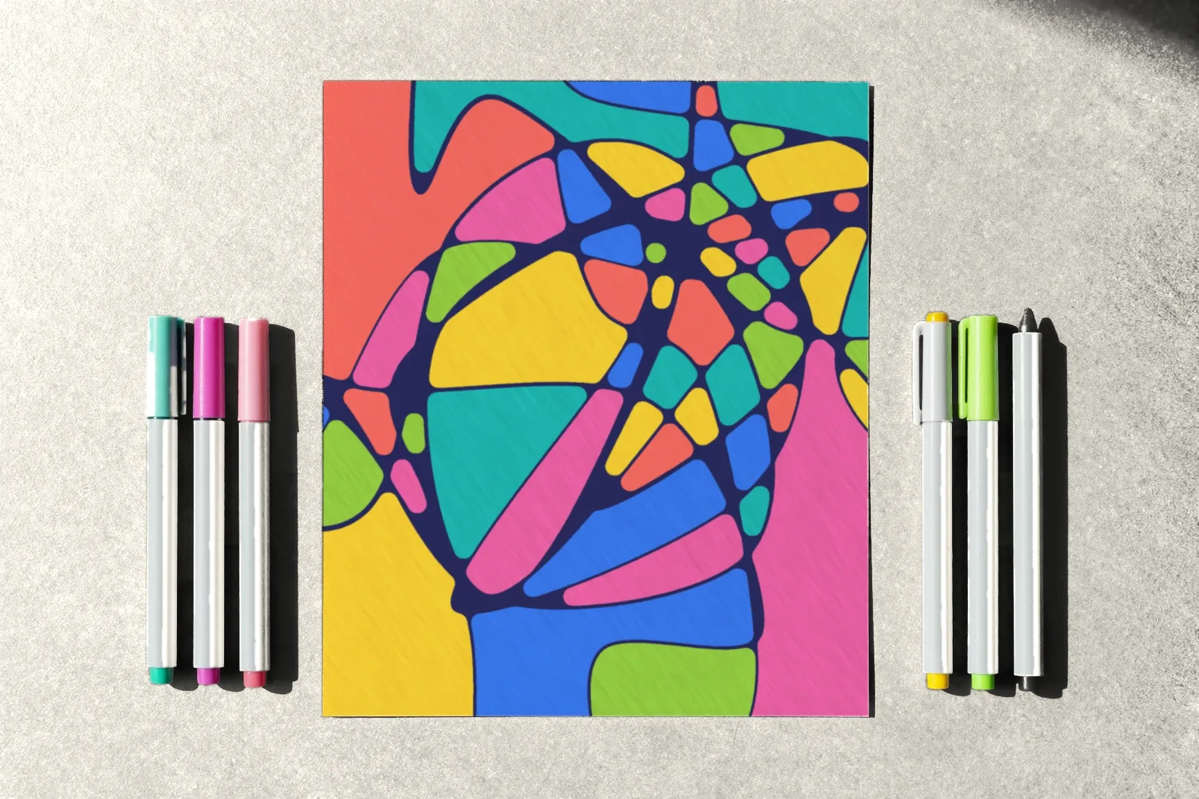
- 150–200 gsm (often labeled around 90–100 lb in mixed-media pads) — marker paper, mixed-media paper, or sturdy sketch pads. The all-round choice: it handles alcohol markers and repeated layers of color.
- 250–300 gsm (roughly 120–140 lb watercolor paper) — needed if you blend watercolor markers with water; more than you need for the basic technique.
For regular practice, 120–200 gsm is the most comfortable range.
Size
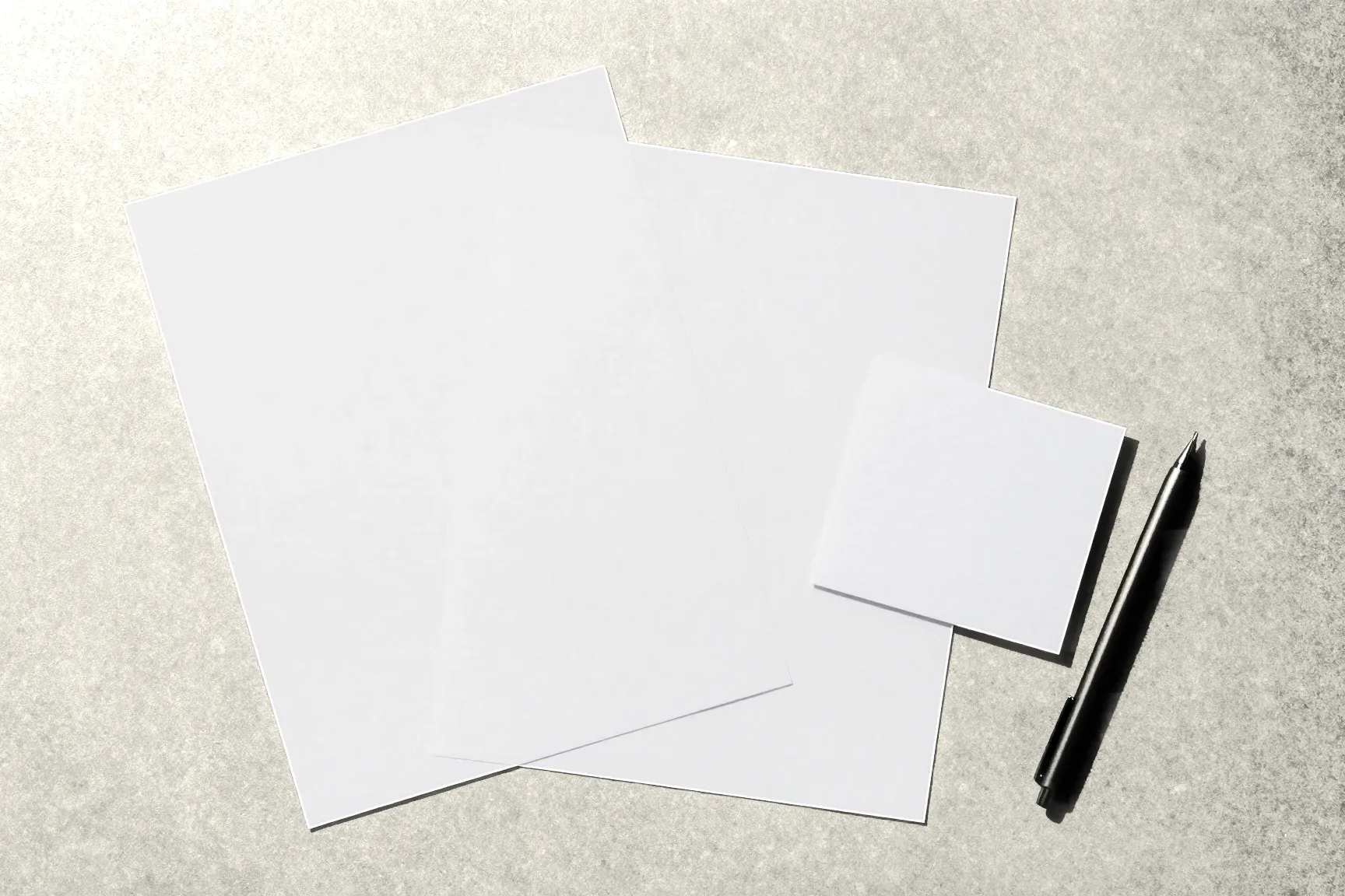
- Half letter (5.5 × 8.5 in) or A5 — for short sessions: three lines, 15–20 minutes, little table space.
- Letter (8.5 × 11 in) or A4 — the main size. It fits three to five lines with room to round. The course’s templates print on it.
- Tabloid (11 × 17 in) or A3 — for large, unhurried drawings. They take more time and space, and a line across the whole sheet uses your whole arm.
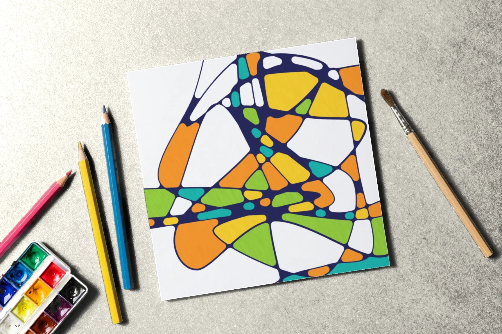
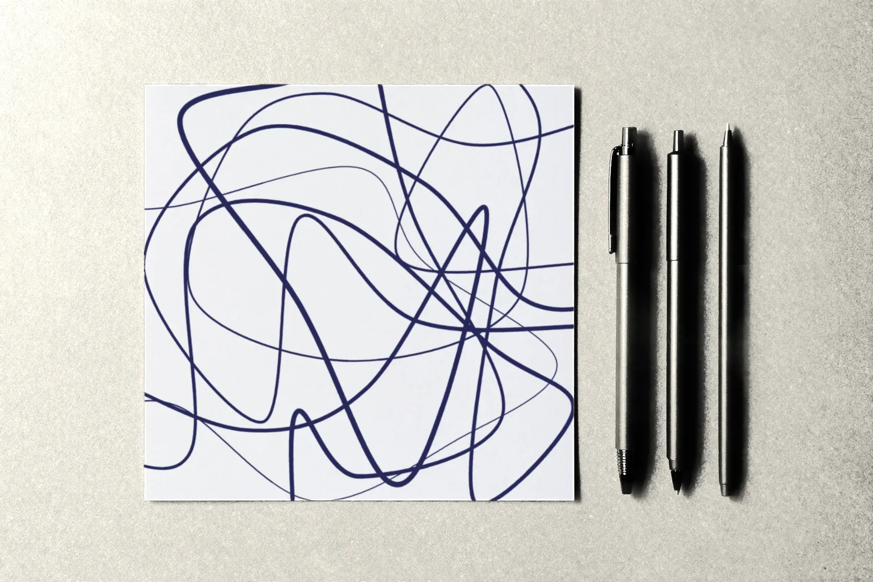
A square sheet is interesting too: the drawing has no “top” or “bottom,” so you can turn it as you go.
Texture
- Smooth paper — the line glides easily and comes out crisp and even. Good for fineliners and markers.
- Lightly textured paper (with some “tooth”) — the line is a little livelier, and colored pencils go down better. Gel pens may skip.
- Rough watercolor paper — awkward for a fineliner, but nice if you blend color with water.
For a first pick, go smooth or lightly textured.
Pad, sketchbook, or loose sheets
- Loose sheets — easy to lay out and compare, and easy to scan or photograph.
- A spiral sketchbook — your drawings stay together, and the page lies flat.
- A block glued on all sides — sheets don’t curl from marker ink because they’re held at every edge.
A sketchbook is convenient, but markers can soak through to the next page. Slip a piece of cardboard under the page you’re working on.
Paper color
White is the classic choice: colors look brightest on it. Ivory or cream paper gives a warmer, softer drawing but shifts your markers’ shades a little. Black or colored paper needs white or opaque markers — that’s an experiment of its own.
How to test a paper
Take a sheet and, along one edge:
- draw a line with a fineliner — does it feather?
- round a corner with a bold pen — does it soak through to the back?
- fill a 1 × 1 in square with a marker, then add a second layer — does the paper pill, or show through on the back?
If it passes, it’s your paper.
What comes next
We covered what else you need to start in What You Need to Start Drawing, and which markers suit which paper in Markers vs. Felt-Tip Pens. The Neurojournal course’s templates print on regular paper — they’re in the lessons of “The alphabet” module. The first module is open without an account — start there.