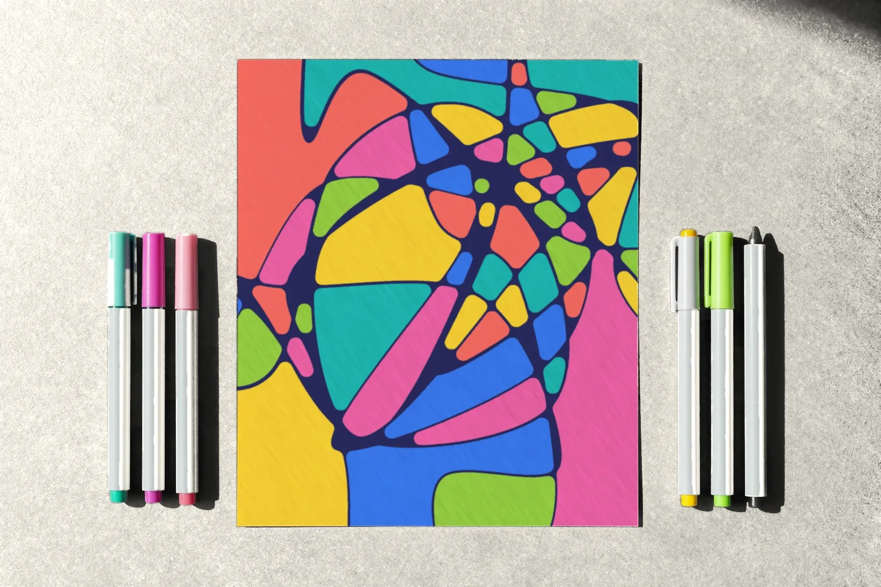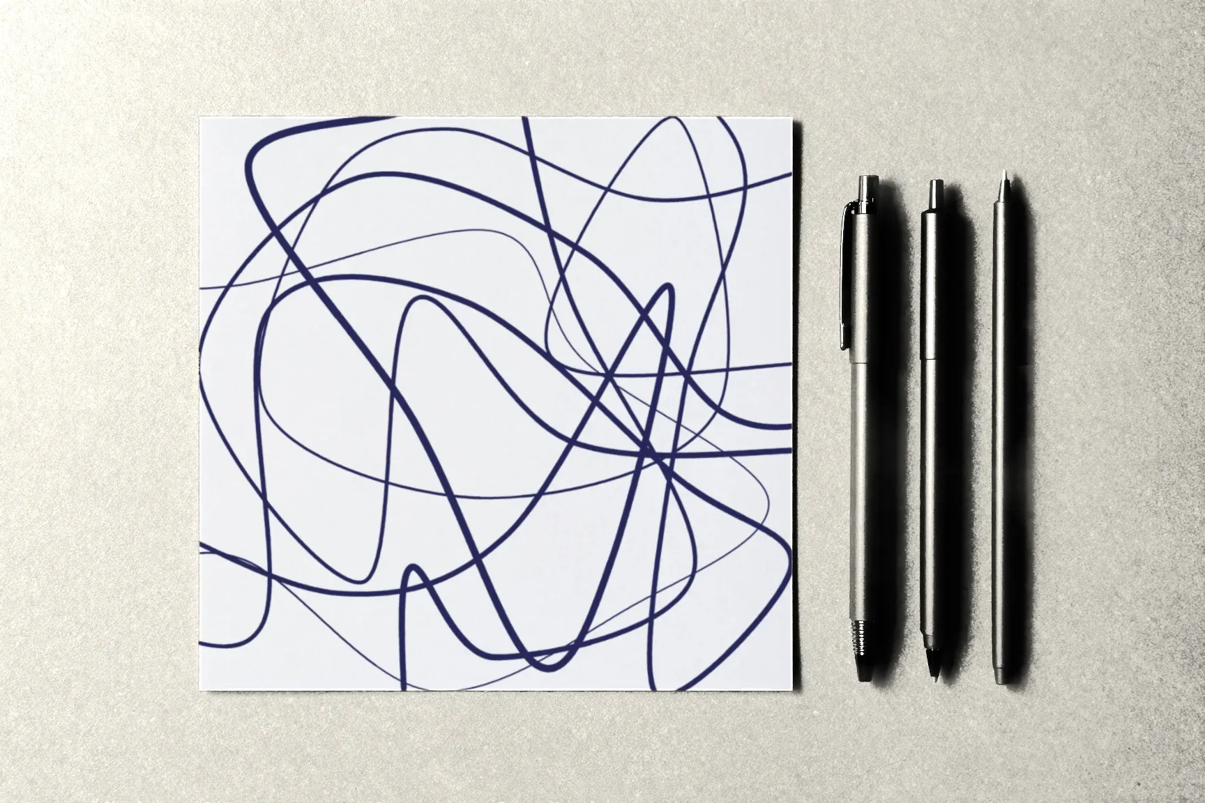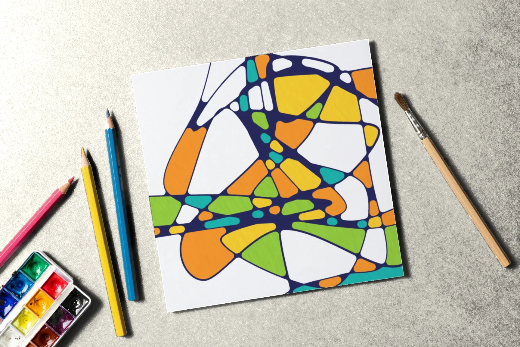
Markers are the most common way to add color in transformational drawing, but not the only one. Colored pencils bring softness, watercolor brings transparency, pastels bring a deep, velvety tone. Each material changes not just how the drawing looks but the process itself: the pace, the sounds, the feel under your hand.
Here’s how the other coloring materials differ, what they change in the technique, and what to watch out for.
Colored pencils
What changes: color goes down gradually, layer by layer. A cell can be even, or it can shade from dark to light.
Pros:
- a slow, quiet process — coloring becomes a part of the session in its own right;
- easy to control: a pencil never bleeds past the line;
- nothing shows through the paper.
Cons:
- large cells take a long time to fill;
- on very smooth paper the color looks pale; paper with a little tooth works better.
Tip: light pressure and several layers give a smoother color than one heavy pass.
Watercolor
What changes: color is transparent, patches have soft edges, and gradients and blooms appear inside a cell.
Pros:
- the most painterly result;
- colors mix easily right on the paper.
Cons:
- you need watercolor paper of 250–300 gsm (roughly 120–140 lb) or the sheet buckles;
- the black line must be waterproof: only a pigment fineliner that has fully dried;
- water easily runs into the neighboring cell, so it helps to paint every other cell and let them dry.
Tip: draw the lines and round the crossings with a pigment fineliner, let it dry for at least 10–15 minutes, and only then pick up the brush.
Watercolor pencils
The in-between option: you color as with pencils, then go over the cell with a damp brush and the color spreads like watercolor.
Pros: the control of a pencil plus the softness of watercolor; you can blend just part of a cell.
Cons: the same paper and line requirements as watercolor.
Pastels
Soft pastels give a gentle, velvety color, but they crumble and smudge. In the small cells of this kind of drawing they’re awkward, and they easily dirty the black lines.
Oil pastels are brighter and don’t crumble, but they’re thick — you can’t fill the small cells next to the rounded crossings neatly.
Bottom line: pastels suit large formats and large cells better than an ordinary letter-size sheet.
Gouache and acrylic
Opaque paints that cover the paper completely.
- Pros: rich, even colors, and you can paint over a mistake.
- Cons: it’s easy to paint over the black line and have to redraw it; you need brushes of several sizes and heavy paper.
How to choose
- You want a calm, slow process — colored pencils.
- You want transparency and gradients — watercolor or watercolor pencils.
- A large sheet with big cells — oil pastels.
- Bright, dense colors — markers or gouache.
You don’t have to pick just one. An interesting experiment: draw two similar pages, color them with different materials, and lay them side by side.
What stays the same
Whatever you color with, a few rules of the technique don’t change:
- Color comes after every crossing is rounded.
- Neighboring cells get different colors.
- The black line should stay crisp: check how your fineliner behaves with the material you’ve chosen.
What comes next
For markers and felt-tips, see Markers vs. Felt-Tip Pens; for paper to match each material, see Which Paper to Choose. How to spread colors across the page is in How to Color Your Drawing. There’s a ready-made drawing for coloring in the colors lesson of the Neurojournal course; the first module is open without an account — start there.