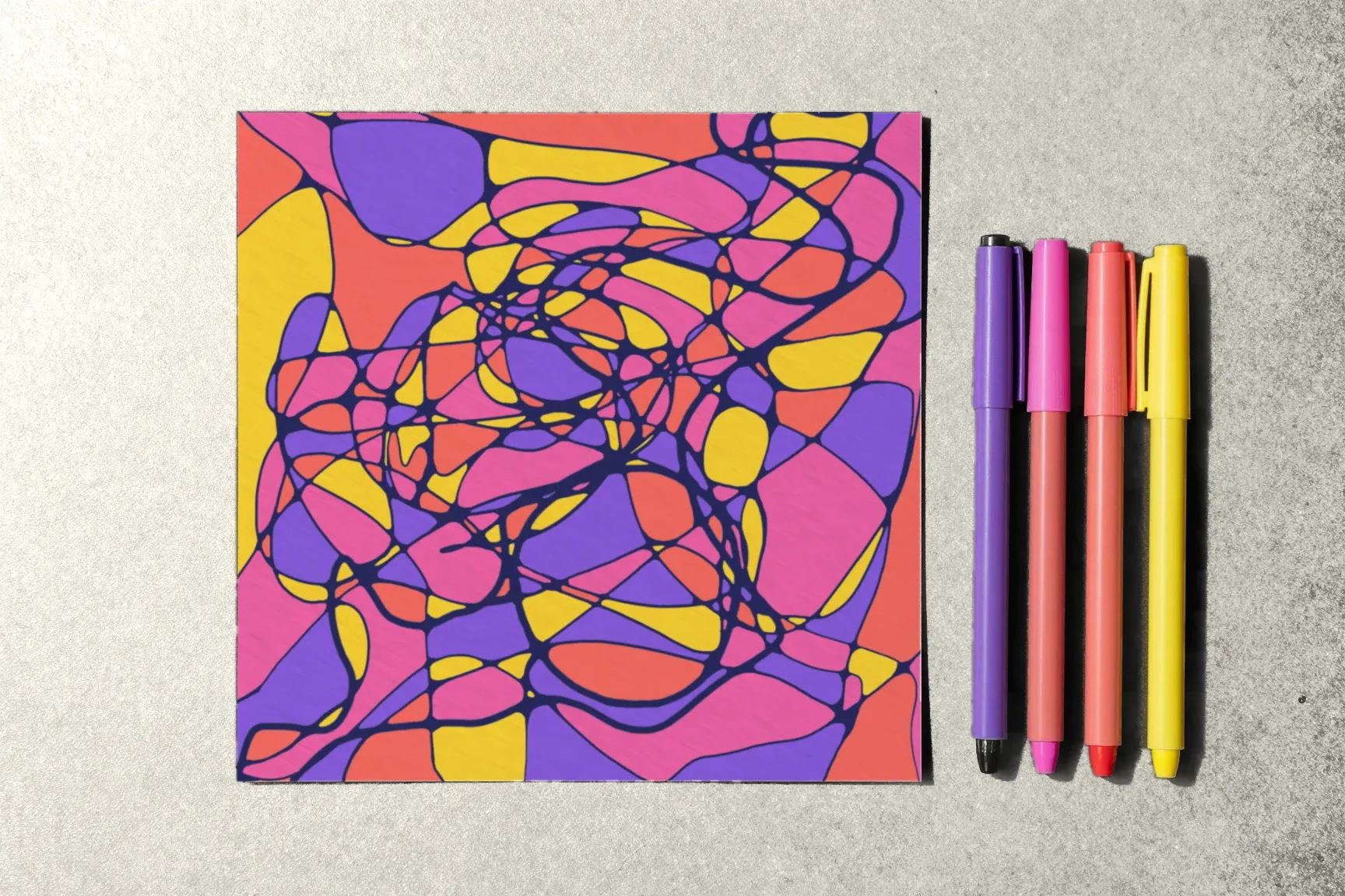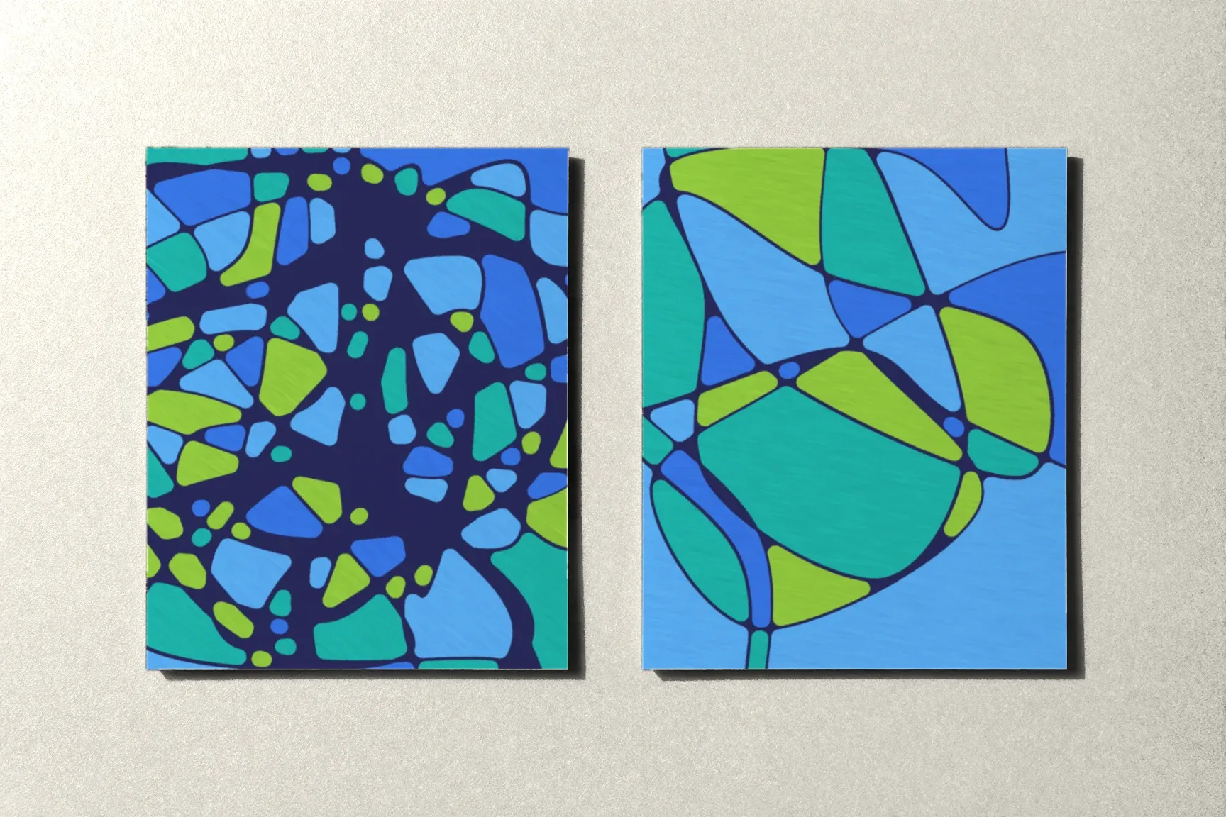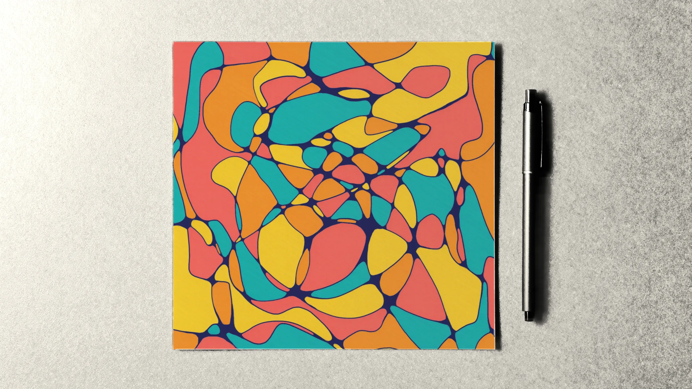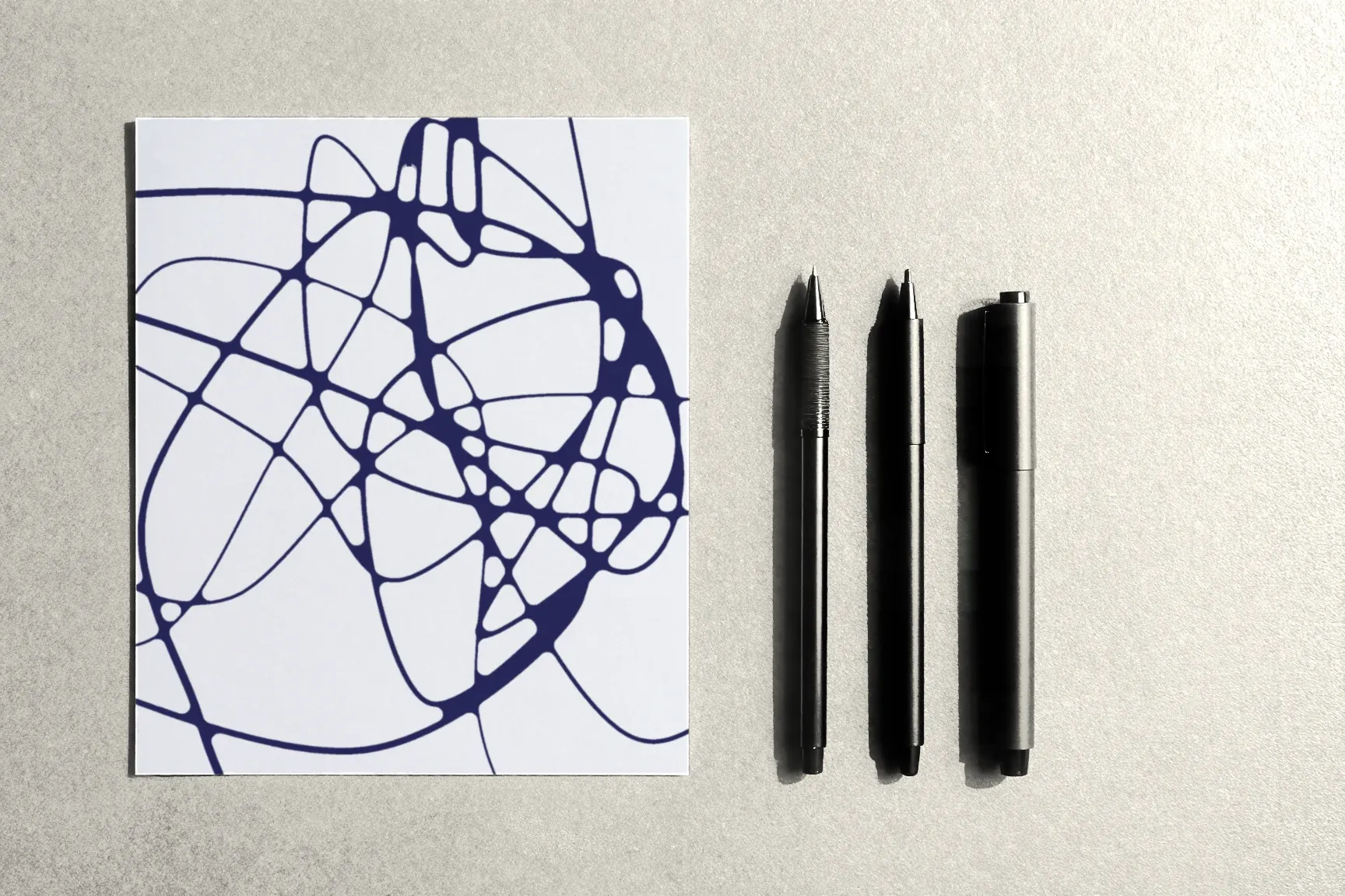
Line weight is a line’s thickness and darkness. The lines in a drawing can all be the same, or they can differ: thin and barely there, thick and confident. That difference changes how the page reads, even when the lines travel exactly the same paths.
Here’s where thick lines show up in transformational drawing, how to draw them, and how to play with contrast in thickness.
Where thickness appears on its own
Even if you draw with a single pen, the weight of the lines won’t be uniform:
- at the crossings. Rounding fills the corners with ink, so the line gets thicker wherever lines meet. That’s one reason a rounded drawing looks denser;
- in crowded areas. Where lines run close together, they merge into darker patches;
- from pressure. Even a fineliner gives a slightly thicker line if you press harder or move more slowly.
Where thickness is deliberate
The course’s algorithms have steps where thickness matters:
- general lines. In the frames of the first algorithm, the general lines across the whole sheet are noticeably thicker than the ones before — they tie the drawing together and catch the eye first;
- the circle. In the second algorithm, the course specifically suggests drawing the circle inside the spiral thick and noticeable.
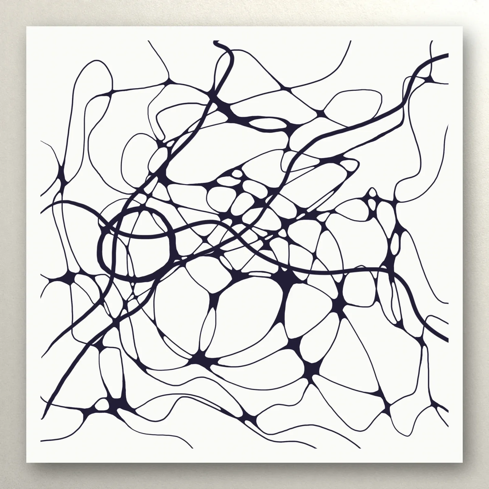
A thick line becomes the “lead” on the page: the eye follows it first, and the thin lines step back.
How to draw a thick line
- A bolder pen. A fineliner of 0.8 mm or more, a calligraphy marker, or a brush marker.
- A double pass. Draw the line, then go along it again, shifting slightly. You get a thicker, slightly uneven line that looks alive.
- Pressure on a brush tip. A brush marker changes thickness with pressure: a light touch gives a thin line, a firmer one a wide stroke. That way a single line can have both thin and thick stretches.
Three approaches to line weight
Uniform weight. All lines the same thickness. The drawing looks calm and even, and the attention goes to the rounding and the color. A good option for first drawings.
Two weights. Main lines thick, the rest thin. For example, the general lines and the circle with a bold pen, everything else with a fine one. The drawing gains depth: the thick seems closer, the thin farther away.
Variable weight. The line changes thickness as it goes, like a brush marker stroke. The most expressive option, but also the least predictable: thick stretches make rounding next to them harder.
Things to keep in mind
- Thick lines make bigger crossings. Where two thick lines cross takes up more room, and the rounding has to be wider.
- Small crossings flood. If two thick lines run close together, the gap between them can vanish. Leave more breathing room.
- Match your blacks. Different pens can be different shades of black. Test on scrap paper so thick and thin lines don’t look like two colors.
- Color over a thick line. A marker that runs onto a thick line disappears into it, so thick lines give you a little more leeway when coloring.
Exercise: the same drawing twice
Take two sheets and draw similar lines on both, following roughly the same paths. On the first, use only a fine pen. On the second, draw two lines with a bold pen and the rest with a fine one. Round both and lay them side by side. Write down which you like better and why — it shows how line weight affects your drawings specifically.
What comes next
We covered how to draw the free line itself in The First Line, and which pens work best for thick and thin lines in What You Need to Start Drawing. The general lines and circles of the algorithms are in Themed Algorithms. The first module of the Neurojournal course is open without an account — start there.