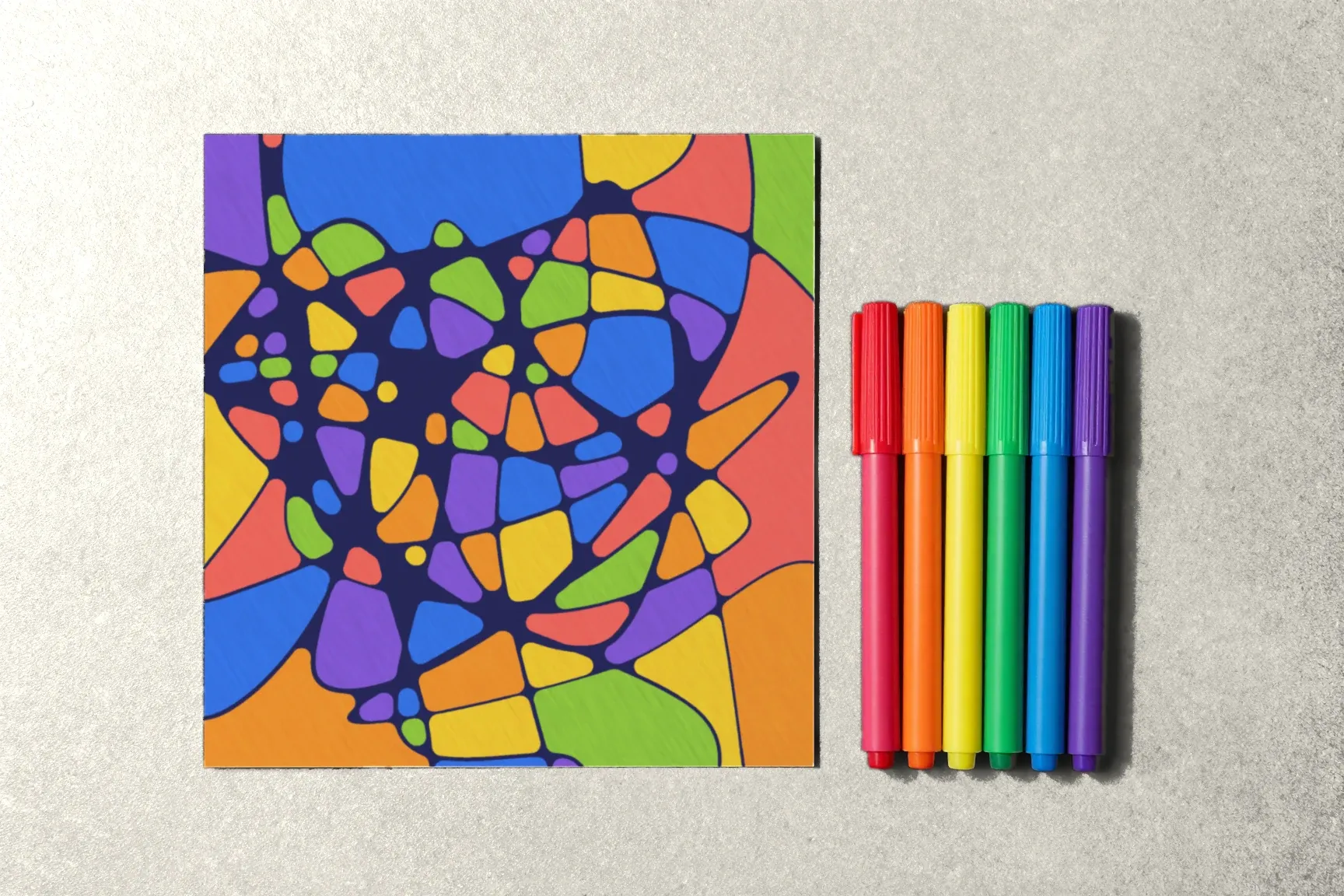
The most common question before coloring isn’t “how do I fill the cells?” but “which colors should I use?” A big box of markers only makes the choice harder. That’s why it helps to have a few ready-made palettes of three to five colors and pick one before you start.
Here are twelve palettes in four groups. The color names are approximate — use the closest shades in your own set.
Warm
- Honey and cinnamon. Honey, orange, terracotta, cream. A warm, calm palette.
- Sunset. Yellow, orange, raspberry, purple. A shift from light to deep — spread the colors so darks and lights alternate.
- Berries. Raspberry, cherry, pink, and one dark-green accent.
Cool
- Ocean. Light blue, teal, blue, and one sandy beige.
- Winter morning. Gray-blue, lilac, light gray, and the white of the paper.
- Forest. Emerald, olive, dark green, and one warm yellow.
Contrasting
- Blue and orange. Two opposites plus a light gray to calm things down. Bright without being busy.
- Purple and yellow. The strongest contrast of the lot. Yellow on small cells, purple on large ones.
- Red and green. Use muted shades — brick and sage — or the drawing will shout.
Soft and monochrome
- Pastels. Pale pink, mint, baby blue, vanilla. A soft drawing in which the lines stand out most.
- One color in shades. Three or four shades of blue (or green, or pink). Calm and unified.
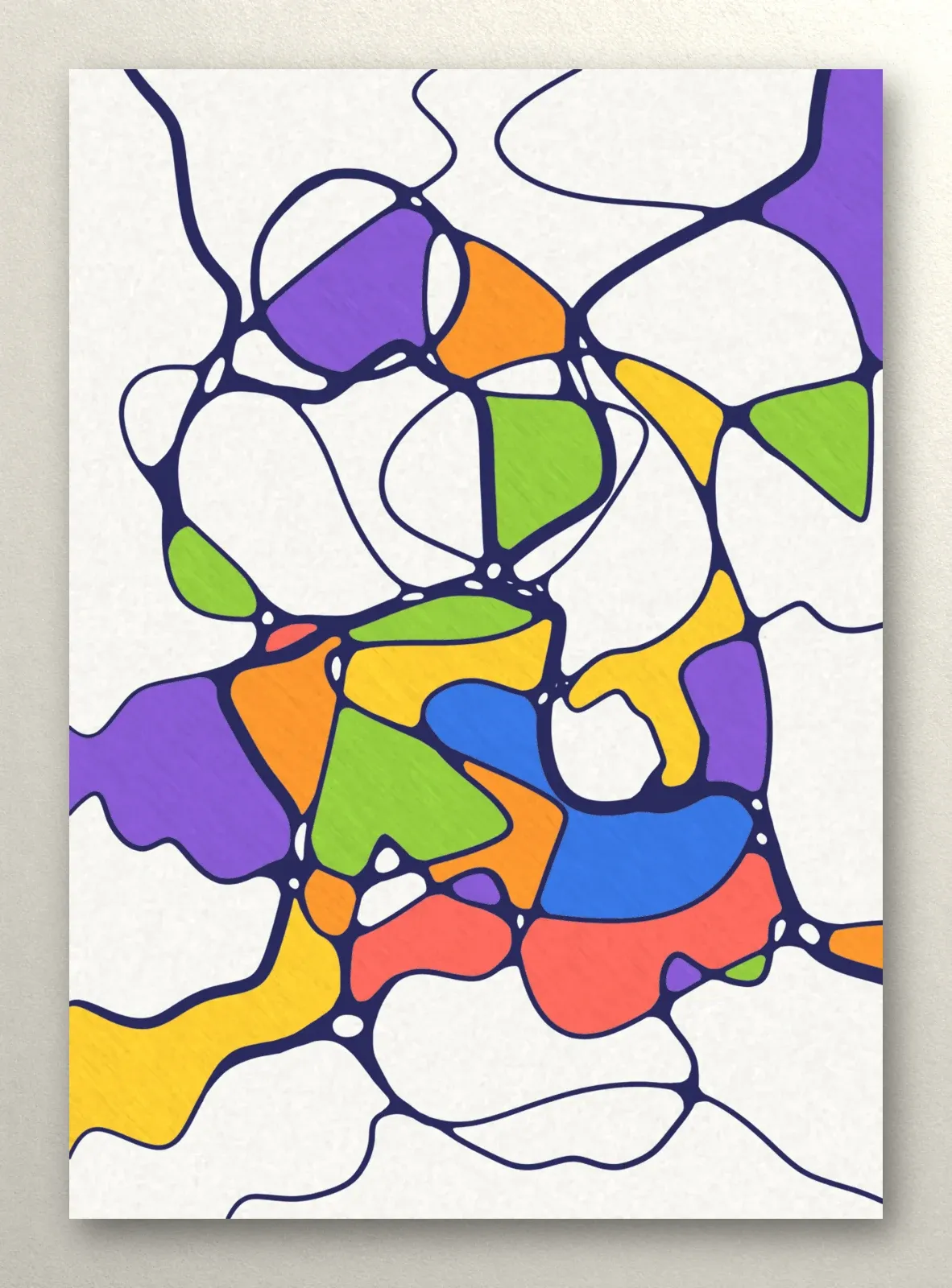
- Black and white plus one. Most of the page stays white, with just a few cells in one bright color — say, red. Simple and striking.
How to choose a palette
- By the mood of the evening. Warm palettes for coziness, cool ones for freshness, contrasting ones when you want energy on the page.
- By cell size. On a dense drawing with small cells, close colors work better; on an airy one, contrasting colors shine.
- By material. Pastels look lovely in colored pencil; contrasting palettes suit markers.
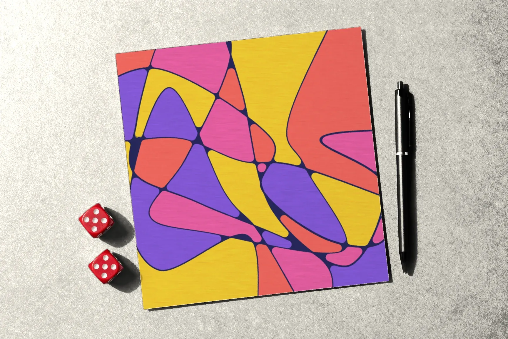
- At random. Number the palettes and roll a die. Sometimes the most interesting drawings come from a palette you’d never have picked.
How to spread a palette across the page
- Start with the main color — fill a few cells in different parts of the page.
- Add the second the same way, in different spots.
- The accent color goes on a few small cells, no more.
- Neighboring cells get different colors.
- White paper is part of the palette too: leave a few cells uncolored.
Make a palette card
On a separate sheet, draw rows of small squares — a row per palette — and label them. Keep the card next to you while you draw, and choosing takes a second. Add palettes you especially liked, and over time you’ll build a collection of your own.
What comes next
How to fill cells with a marker or pencil is in How to Color Your Drawing, and seasonal palettes are in Fall Drawing Ideas. What to color with is in Markers vs. Felt-Tip Pens. The first module of the Neurojournal course is open without an account — start there.